Improving the digital reading experience
Using human-centered design to boost adoption and improve learning outcomes for digital textbook users
Overview
Pearson is an educational company that for years has catered primarily to the needs of the instructors. Our goal for this project was to focus on the student to create a compelling, modern digital reading and study experience.
Role
In collaboration with a team of user researchers, learning designers, and product managers, I led foundational research, co-facilitated a design workshop to ideate solutions, and conducted lean, iterative testing to arrive at a solution.
Tools & methods
Contextual inquiry
Interviews
Survey
Participatory design and concept testing
The problem
User studies have repeatedly shown that many college students don’t like digital textbooks. In fact, students say they prefer to carry around a heavy, printed book because digital textbooks are too hard to navigate and use. The reasons students dislike digital textbooks vary, but all of them result in impeded learning and comprehension.
We at Pearson wanted to know what was really going on below the surface. After all, students happily use technology in their daily lives for all sorts of things. So, what was so wrong with digital textbooks that led students to avoid them?
My approach
Research setup
The research I conducted for this project focused on a few key areas:
Understanding current usage behavior: How do students use print and digital materials to read and study currently? What are the specific barriers to adopting digital materials?
Validating and refining design concepts: Can we design a digital solution that still meets the learning needs of students?
To understand current usage behavior, we triangulated data from qualitative and quantitative research studies to identify key themes. To ensure that our new designs met the needs of students, we conducted a series of low fidelity, participatory concept tests with students as we refined and iterated on our ideas.
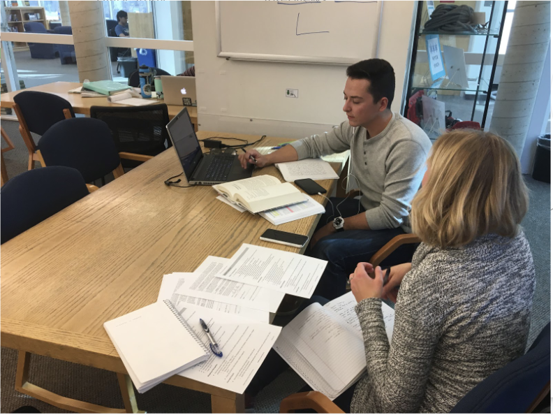
Contextual inquiry and remote interviews
To understand current behavior around textbook and digital device usage, our team began by conducting a series of 26 in-person contextual interviews as well as 26 remote interviews at a variety of higher ed institutions and across majors. We intercepted students in university libraries and observed them as they completed homework or prepared for exams using a variety of print and digital materials. This allowed us to observe first-hand how students physically interacted with textbooks, and how they used notes and other material in conjunction with their course materials.
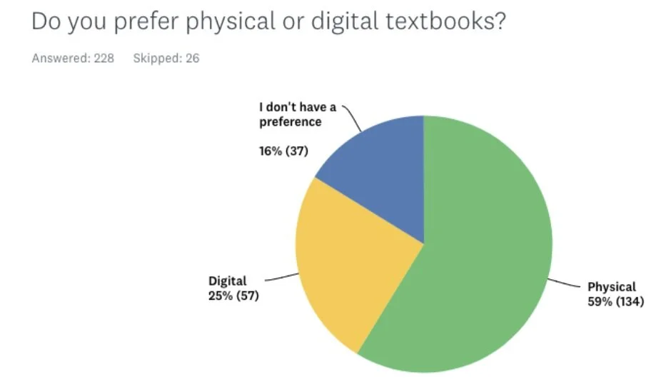
Survey
To validate and quantify the behaviors and attitudes uncovered in our qualitative research, we launched a survey to 254 students across disciplines, institutions, and personas.

Research findings and synthesis
The research led us to focus on three key insights. When students use digital textbooks, they:
did not have a good sense of their current location.
found it hard to browse and scan to find specific content.
could not estimate how long a section would be.
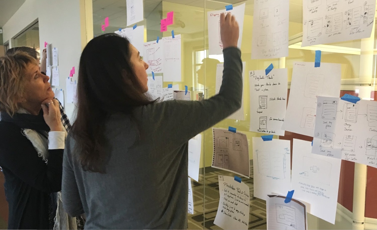
Design workshop
We convened a group of UX designers, learning designers, product managers, UX researchers, and writers for a week-long design workshop. We started by reviewing all of the research, ensuring that we all understood the students' needs. Then, we created journey maps to identify tasks, touch points, pain points, and opportunities for each of the primary use cases we had identified.


The team identified two design opportunities to focus on in our upcoming design sprints:
Indicating progress and location within a textbook
Being able to scan content in an overview
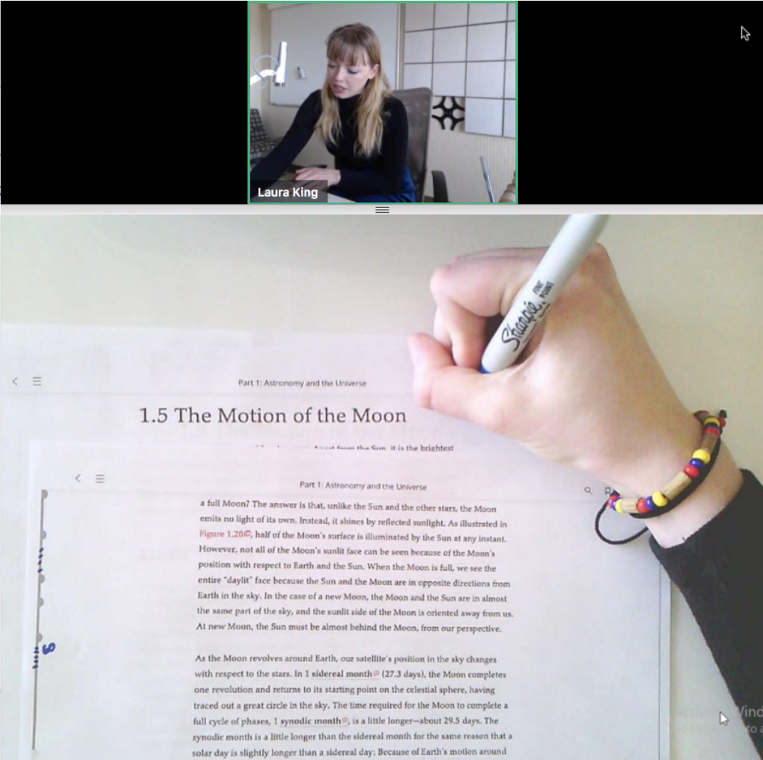
Iterative testing and co-design
After the design workshop, our design sprints began. The strategy was to start small and iterate rapidly while testing with users to refine our solutions. Over the next two months we iterated on design solutions through rapid, one-week design sprints. We spent the first part of the week exploring different concepts, and came together to decide what to test with students. By the end of the week, we had results from testing to refine our concepts and plan for the next design iteration. Our weekly cadence allowed us to test early and often throughout the design process. We began with paper prototypes and allowed the student participants to scribble corrections on our designs and contribute their own ideas.
Outcome
In this process, we discovered and honed in on a solution. The “content strip” is a solution that allows the user to see all pages of a chapter in a drawer. The user can enlarge the drawer so that images, videos, page numbers, etc. are clear. The user can then flip between these multiple locations. Students had a very positive to this design, and it afforded them to find their place in the text, scan and easily find content, and estimate the amount of work they had in an assignment.
Designs

The drawer is triggered from the floating CTA in the margin.

It defaults to quick scan nav mode.

The content strip magnified.
User Feedback
Students responded enthusiastically to this design and felt that this offered a novel solution to key pain points in digital reading.
“Instead of having to look at it as a whole huge giant mess and try to figure out where those things are, it’s easier to be able to go through and recognize where you need to be. ”